4 Fantastic Network Visualization Tools
 As internet usage has grown, so too have the various online networks which connect family, friends, colleagues and people with shared interests.
Whilst, it is often easy to gain a numerical overview of connections, friends or followers, this tends to add context, rather than insight – the fact remains, it can be difficult to dig that bit deeper and see how people within networks are linked.
This poses a challenge for digital communicators as we want to tap into big, social data and visualise networks; so we can see how ideas may spread, understand who knows whom and identity people that are influential within a particular context. After all, if you can understand a network, you gain insight into who people may trust, find influential and credible.
In short; being able to accurately visualise networks has big implications for influencer mapping, identification and outreach. If you can discover who the idea starters, amplifiers or adapters are, you are at a distinct advantage (check out ‘The Fire Hose, Ideas, and ‘Topology of Influence’ by my Edelman colleague, Jonathan Hargreaves for more information on influence).
The good news is that there already are some excellent free tools available which utilise ‘big data’ to understand the composition of networks, identify influencers and inform outreach. Here’s four such tools I’ve been using over the last couple of months:
1. TouchGraph (websites, topics or Facebook)
An old favourite of mine. TouchGraph is a fantastic tool that lets you map networks and see connections between websites, people or Facebook friends – and can help identify idea starters, amplifiers and adapters. The strength of TouchGraph is that it enables you to accurately pinpoint the relationships between chunks of information in an easily digestible and more importantly, actionable way.
2. Google+ Ripples (Google+)
This tool uses ripples to show how users share posts on Google+ throughout their networks. The vast potential of Google+ Ripples is nowhere near being fully realised, but what makes Google+ Ripples valuable to digital communicators is that you can easily identify who amplifies content effectively. You can even play back Ripples to watch the spread of a particular post to see who and where reverberation was generated.
3. MentionMap (Twitter)
MentionMap helps you make sense of the seemingly endless ‘noise’ on Twitter and intelligently maps networks to see who people are talking to and what they are talking about. Although, Tweets are short-life content, Twitter is fantastic for driving online traffic and amplification, so this tool should be utilised when you’re trying to workout who is influential and amplifies content within particular areas or networks.
4. InMaps (LinkedIn)
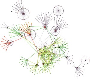
InMap is interesting, rather than useful as it offers a visual representation of your LinkedIn connections. Whilst, it’s interesting to see your network mapped, along with connections and commonalities, it is limited to just your profile and is perhaps best utilised when job-hunting. What would be very useful is the ability to map other people’s networks. This would elevate InMaps to a position of not only use, but great value.
What network visualization tools do you find particularly useful?
This article is also translated to Serbo-Croatian language by Jovana Milutinovich from Webhostinggeeks.com.


Hello!
May I also suggest the free and open NodeXL, the network overview discovery and exploration add-in for the familiar Excel Spreadsheet. With NodeXL it is easy to access, analyze and visualize social media networks from Facebook, Twitter, YouTube, email, Flickr, Message Boards, the WWW, as well as other network file formats.
http://nodexl.codeplex.com
Regards,
Marc (from Team NodeXL!)
Hey Marc,
Thank you for sharing NodeXL – I’ll definitely check it out.
Thanks,
Ben
[…] socialwebthing.com – Today, 1:35 PM Rescoop […]
[…] This post was originally published on Ben Cotton’s blog Social Web Thing. […]
[…] This post was originally published on Ben Cotton’s blog Social Web Thing. […]
Quadrigram is especially powerful for building interactive graphs and network visualizations. The nice thing about this platform is that you can build networks on top of maps as well!